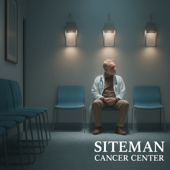
Redesigning Corporate Healthcare Workflows
I partnered with oncologists to tackle a major challenge: their patient and practitioner portals were failing to deliver critical information. We completely reimagined how vital treatment data could be organized and accessed digitally, making it intuitive to navigate complex medical systems.
Key Challenges
Problem: The existing platform was difficult to manage and navigate, causing frustration for patients, researchers, and admins seeking cancer and treatment information.
So what was happening?
- Users couldn't find relevant clinical trials becauase of poor search functionality
- A complex and outdated interface created friction for patients and researchers
- Poor information architecture caused users to abandon searches quickly
- Low engagement due to trust issues and ineffective trial matching
High Search Abandonment
Users are starting clinical trial searches but leave without finding relevant studies.
Poor Trial Discovery
Low success rates in connecting patients with appropriate trials despite adequate traffic volume
Navigation Frustration
Disconnect between user intent and the platform's ability to surface relevant clinical trial options
User Centric Process
Discover
Conduct user interviews and market research for insights.
Define
Create empathy maps, user journeys, and problem statements
Validate
Gauge overall usability, run A/B tests and measure user outcomes.
Hand-Off
Deliver detailed specifications and design systems, collaborate with engineering
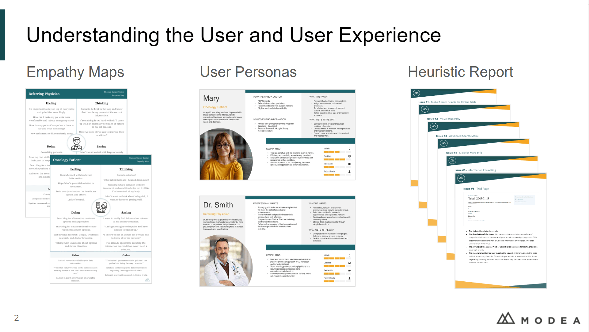
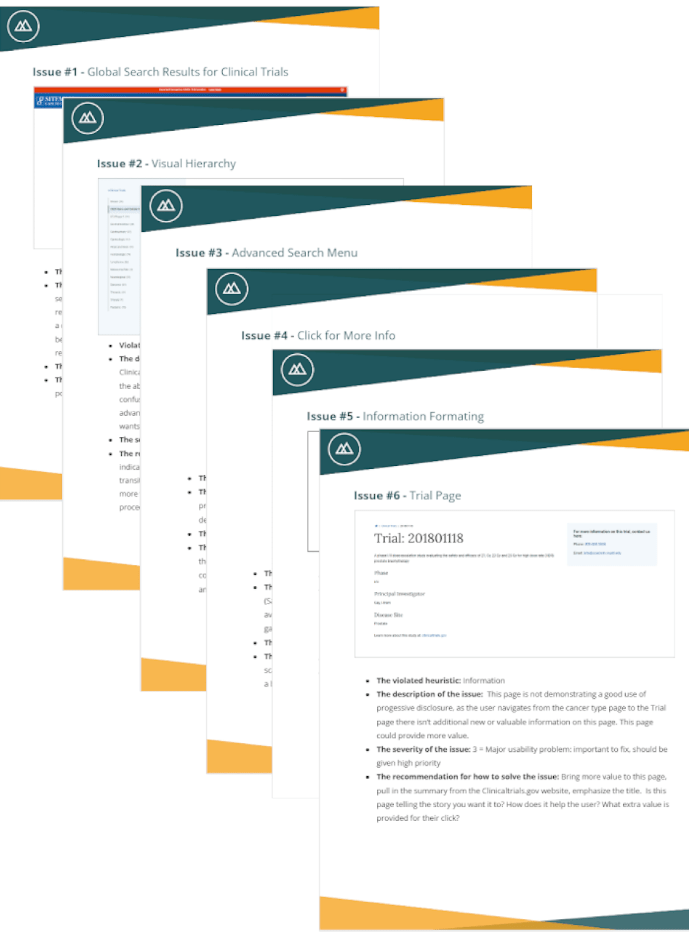
Heuristic Analysis
Working closely with stakeholders across internal and client teams, I conducted a comprehensive analysis of clinical trial platforms and healthcare search experiences, identifying key opportunities to inform a more effective and user-centered discovery experience.
Search and Discovery
Research
I interviewed dozens of oncology patients, caregivers, and referring physicians to understand their experience and core needs when searching for clinical trials.
Interview Method
Due to patient privacy requirements and geographic spread across cancer centers, I conducted remote interviews with patients and caregivers via
secure video calls, using screen-sharing to observe their trial search behavior in real-time
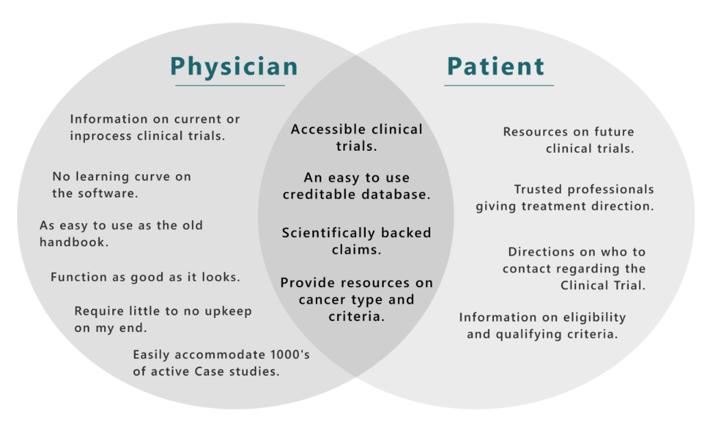
Key Insights
For cancer patients and their families, clinical trial discovery prioritizes trust, accessibility, and clear communication over quick decisions.
The search process is emotionally-driven and relationship-dependent - patients need confidence in both the trial eligibility and the
research institution conducting the study.
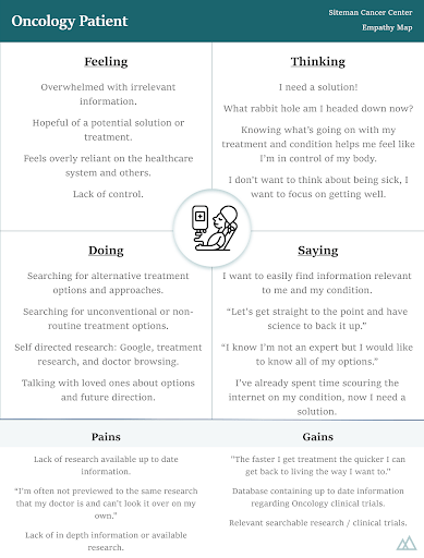
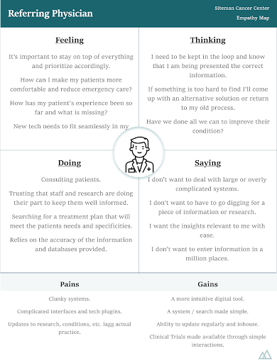
Empathy Mapping
Empathy maps focused on user pains, motivations, and actions, revealing benefits of improved search, defining usage patterns, and guiding direction. By mapping the emotional journey of patients and caregivers searching for clinical trials, we identified critical moments of frustration, hope, and decision-making that directly informed our information architecture priorities and content strategy approach.
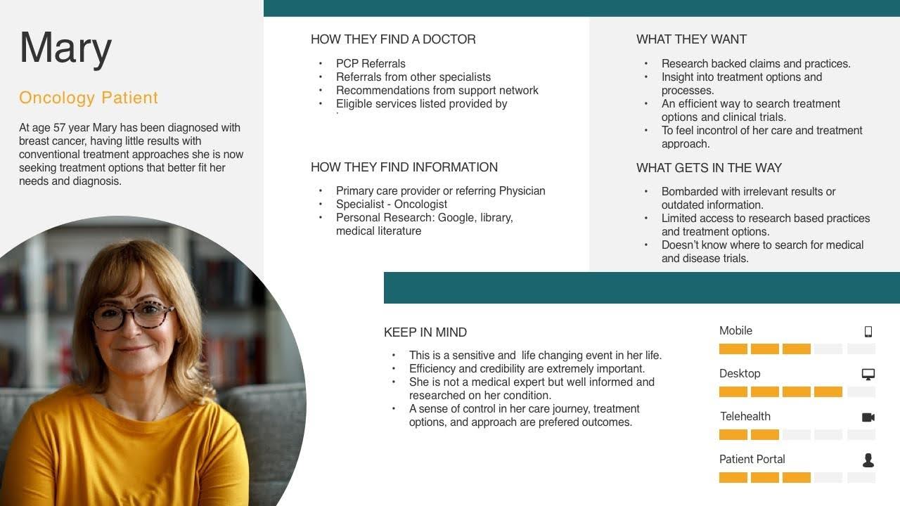
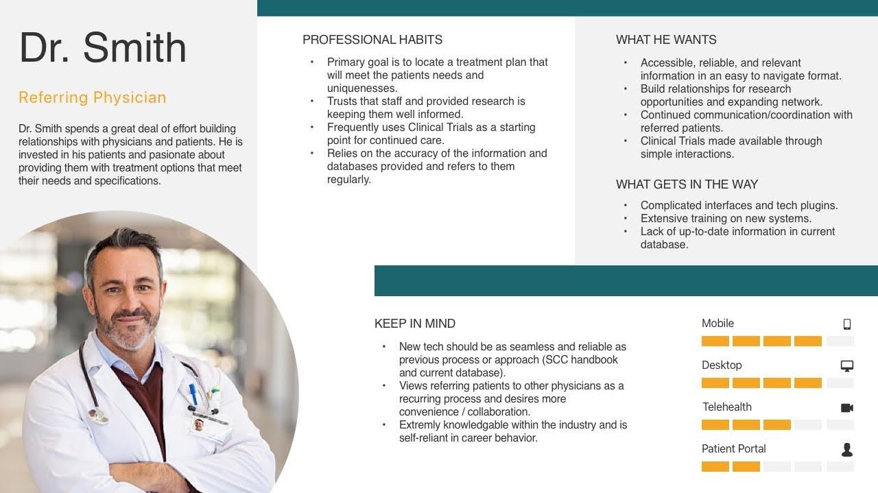
Creating User Personas
Building on my interviews and competitive analysis, I developed user personas that captured the distinct needs of cancer patients, trial seekers, and physicians. These personas helped prioritize features and guide design decisions for users navigating critical healthcare decisions during vulnerable moments in their cancer journey.
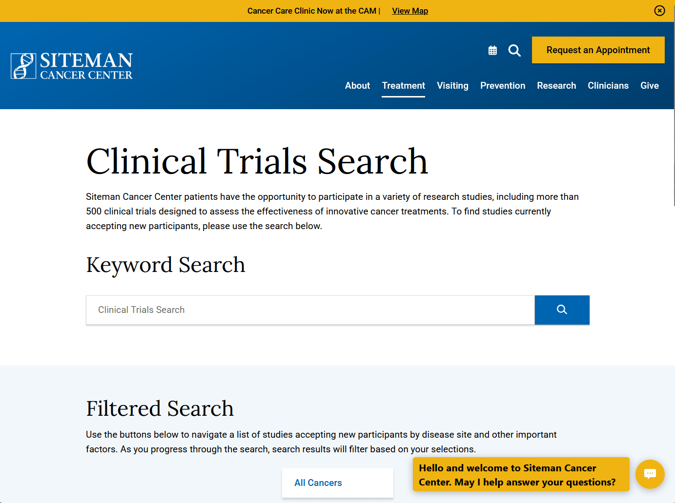
Current Search Experience
The existing oncology search experience is disjointed, complicated, and frustrating. Both patients and clinicians struggle to find the information they need across multiple disconnected platforms, leading to delayed treatment decisions, missed clinical trial opportunities, and a poor customer experience that abandons users when they need help the most.
The Impact
This disjointed experience creates critical gaps in the patient journey, leading to:
- Delayed treatment decisions
- Missed opportunities for clinical trial participation
- Increased burden on healthcare providers
- Suboptimal patient outcomes
- Frustration and abandonment of the search process
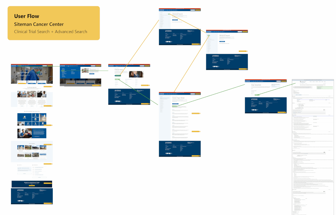
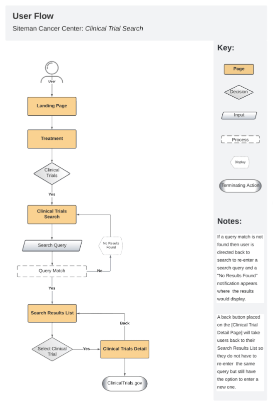
User Flows
The clinical trial user flow was mapped to visualize the journey, identify bottlenecks, and understand user movement through the experience. By documenting each step from initial search to trial enrollment, we uncovered critical drop-off points where patients abandoned their search and pinpointed opportunities to streamline the path between trial discovery and meaningful next steps with research teams.
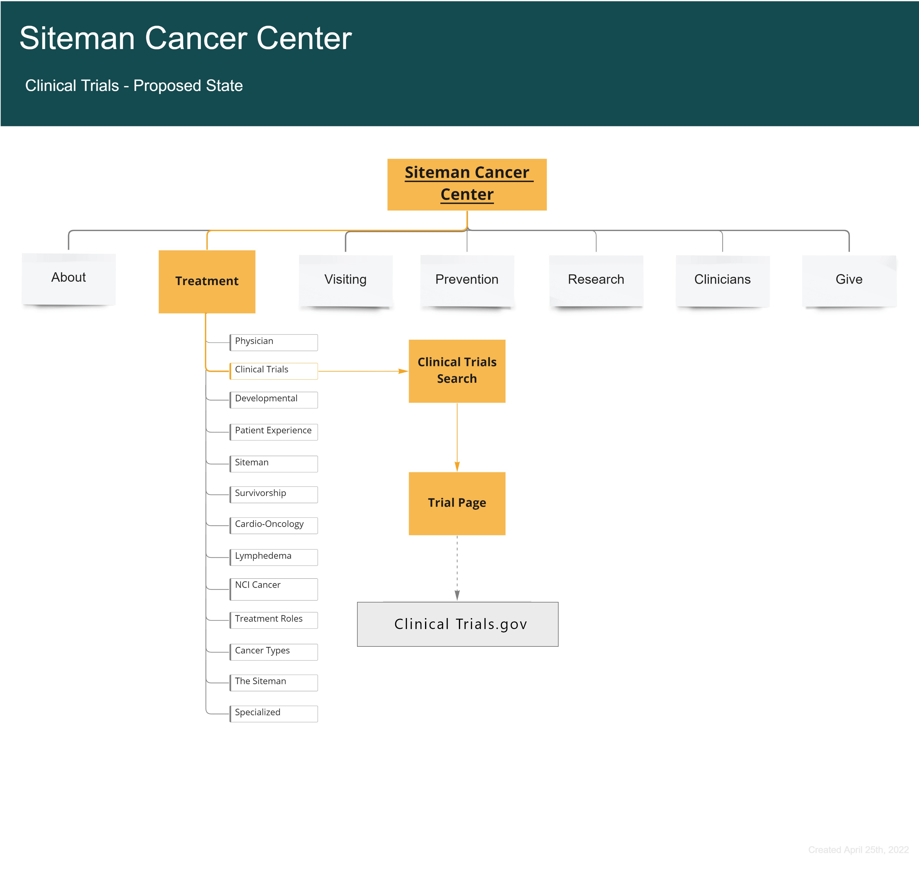
Information Architecture
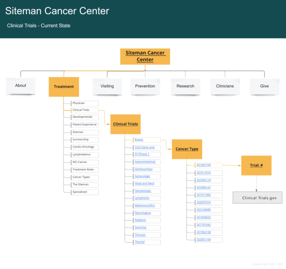
Current IA
Navigation through the accordion folders was cumbersome and left users frustrated and empty-handed. The deeply nested folder structure forced patients to guess at medical terminology and category hierarchies, creating multiple decision points that often led to dead ends and high abandonment rates.
New IA Structure
Proposed information architecture would remove the folders and allow a robust search bar to take over the hierarchy, simplifying engagement and access to the database of NIH Clinical Trials. This search-first approach eliminates cognitive load by letting users describe their needs in natural language, making trial discovery intuitive for both patients and healthcare professionals.
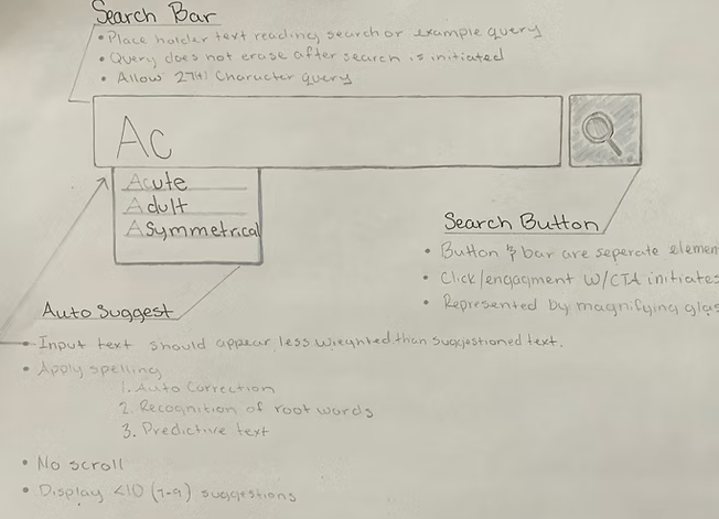
Sketching
Quick sketches helped us explore different search interface ideas before diving into detailed wireframes. These rough concepts made it easy to collaborate with developers, figure out what was technically possible, and set realistic expectations for the clinical trial search features.
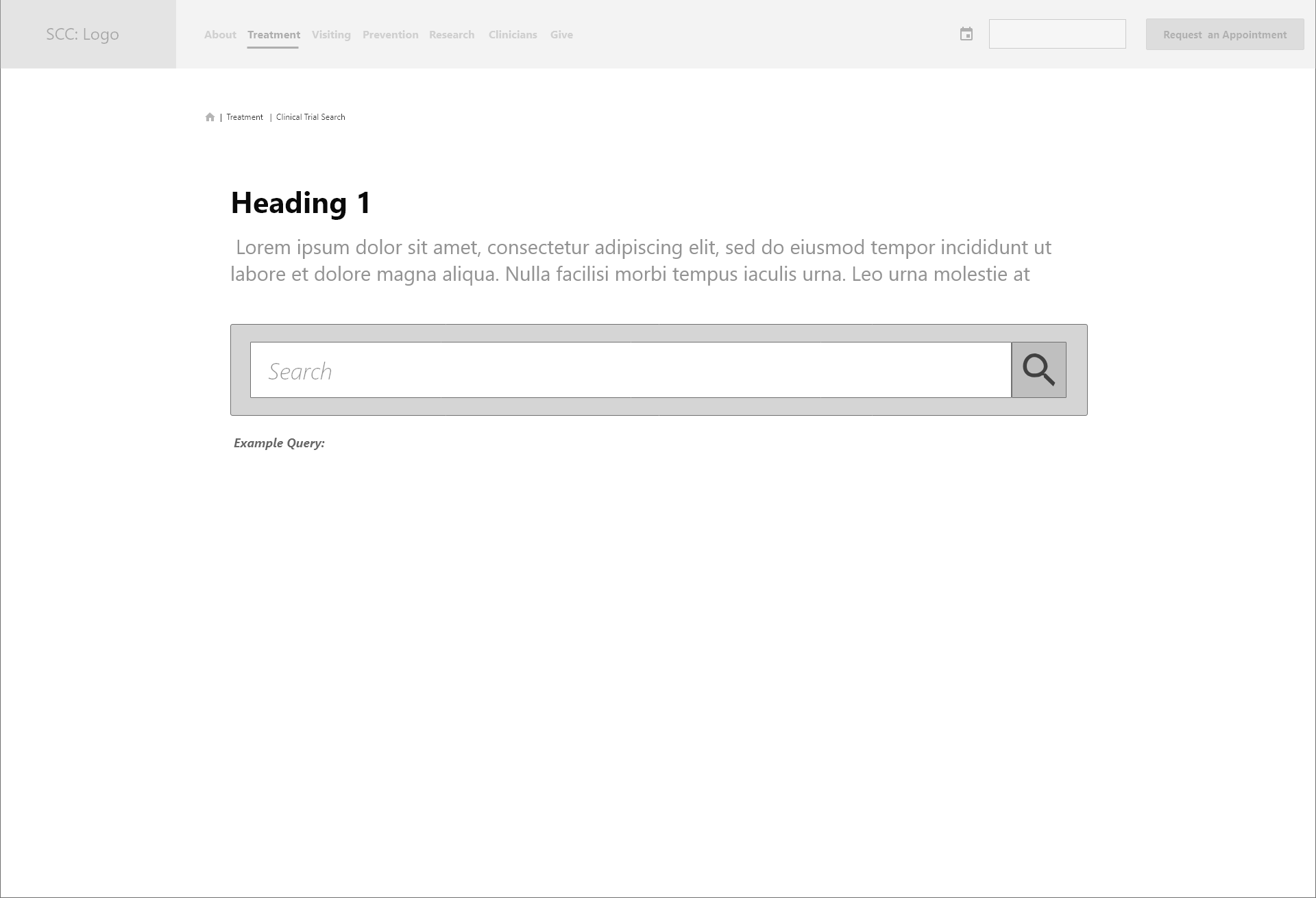
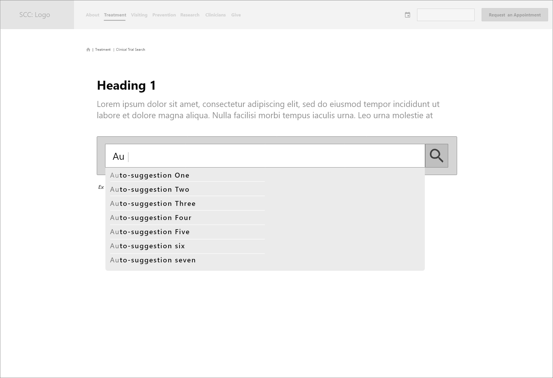
Wireframes
Wireframing began to bring the designs to life and provided a basis for feedback, iteration, and development. Building on our sketched concepts, these wireframes translated the simplified search-first approach into concrete layouts that stakeholders could visualize and test.
Moderated Usability Testing
Testing Details: To validate our wireframe concepts and information architecture decisions, we conducted moderated usability testing with participants from the client's pool. Using UserZoomGo for remote testing, we gained insights into the user journey, identifying specific pain points and motivations as participants navigated the redesigned search experience.
This testing revealed how effectively our simplified approach addressed the original navigation frustrations and guided final refinements before development.
Usability Metrics
User Feedback
- Credibility/Trust: Users want to see doctor/institute information upfront
- Content Relevance: Protocol numbers aren't meaningful to patients
- Visual Clarity: Text-heavy content needs visual aids for quick comprehension
- Educational Support: Users need learning resources before making decisions
Collaboration and Implementation
My annotated wireframes bridged user insights and technical implementation, explaining not just what elements should appear, but why. Drawing from user interviews where patients struggled with hidden credentials and medical jargon, these specifications equipped developers with the rationale needed to build our research-driven clinical trial search solutions.
High Fidelity Designs
Based on moderated usability testing insights, I refined the design and functionality choices before moving to high-fidelity prototypes. The first round of polished screens incorporated user feedback on search functionality, trial information hierarchy, credibility indicators, and the inquiry submission flow.
Reflection & Impact
In healthcare, poor UX can directly impact patient outcomes since usability often drives critical healthcare decisions. Through user-centric design and close collaboration with oncologists at leading cancer centers, the redesigned clinical trial search experience delivered measurable improvements for both patients and healthcare professionals:
- Intuitive search functionality replacing complex folder navigation
- Clear trial information with prominent doctor and institution credentials
- Accessible trial discovery with visual aids and educational resources
- Streamlined inquiry process connecting patients to research teams
- Integration with NIH clinical trials database for comprehensive coverage
"The solution transformed clinical trial discovery from frustrating folder navigation to intuitive search that prioritized patient needs."
Key Project Reflection
Wins
User-centered approach, successful cross-functional collaboration, and a streamlined solution
Challenges
Balancing detail and clarity, ensuring accessibility despite complex medical terminology
Future Focus
Post-launch analytics,
A/B testing on filters and CTA's, rolling out insights across the site